Monday, 12 December 2011

Photo Edits and style designs, dan


This is just some photo design edits for ultimately a magazine cover with a clear influence from Batman, The Joker. A part from this I'm pleased with the photo and I like the background and could potentially become a good looking magazine cover photo.
This isn't too much change to this photo. Firstly, the photo was made black and white. This is done because it creates a dark and artistic look. The majority of the editing in this photo was creating the shadow in the top left hand corner. This was extremely time consuming because I had to take the shadow from the model and re-shape it to look male. Problems occurred because the copy of the shadow had sharp edges and didn't look like a shadow at the time. I then blurred the edges and tweaked the colour tones and it began to look good. Eventually I created a realistic looking shadow that hopefully gave a creepy feel. I wanted to create a strange look that suggests that the shadow is a ghost's shadow.

Film Poster Development 2 - Beki


I think the white text among the black background is effective yet the image of the protagonist is too close up and would be more beneficial if it was a medium close-up; this can be changed. The font does not suit the genre and style but this was only a rough draft of this idea and can easily be substituted for a more suitable font. 

Film Poster Development - Beki

After reviewing the first draft of our film poster I went onto Photoshop to experiment with some ideas on how to improve.


We decided to add a ouija board into the background as the plain white was not effective. As a group we felt this idea was more successful and made the theme apparent from simply looking at the film poster to give the spectator an idea of what 'Through my eyes only' is really about. This draft was completed very quickly and is only a rough idea. I think the 'thresh hold' effect does not blend with the grey scale effect on the ouija board: this could easily be changed.

To expand on this idea I briefly experimented with a red tint over the ouija board to add to the horror theme.

Once completing this our group felt this didn't create the desired effect and we decided not to per-sue with the red tint any further. 

Poster Ideas, Emily Fry-Sheehan

Here is my first idea for our film poster for Through My Eyes Only. By using photoshop, I placed a photo of a ouija board that Dan took over an image of Soraya that I took. I did this by making the photo of a ouija board a separate layer, then I adjusted the opacity to make the image come through onto Soraya's portrait. 
I like this image idea, but I cannot think wear to place the movie title and other features of a movie poster, without ruining the effect of the image.

Here's another poster idea I did in the style of the Paranormal Activity 2 trailer. I used the idea of the ouija board over an image again, and tackled the problem of not know where to put the text by adding two sections of black, one above and one below, the central image. 

Thursday, 8 December 2011

First poster designs, Dan

This is our first draft of a film poster and considering its a firs draft I'm pleased with the look. I like the threshold effect used on the main character but through using this it makes the left side look weak. Because of this the attention is focused on the character and not the title. Also the white on the left looks to blank and the poster needs re-working to create a more professional look to the poster. We have a few ideas to make the poster slightly more interesting such as, mise-en-scene brought into the background like a Ouija Board. 

After deciding the background needed something, something to create more intrest. I went with the idea of using a Ouija board in the background. I'm happy with the development of the poster but it's still far from a final design. The process of this second design was creating another layer of a Ouija board and putting the photo the top layer. Then I brought the opacity down do that they blended together making a more interesting background. The problem with this is that the photo of the character was faded to much so I went a stage before I lowered the opacity and copied a silhouette of the character and pasted it again on another layer and put that layer on top. Once this was done i would lower the opacity and then the photo of the character still stood out.     


After the first two poster designs I changed photo and then designed the other two posters. I changed photo firstly because I felt like I had run out of ideas with that image. Also I wanted to create a poster design with this photo simply because I think it's a great photo. It was originally taken in colour and only included the girls shadow. The second shadow and the black and white effect was added to aid the genre conventions of horror. The second shadow creates a mysterious and enigmatic ambience to the poster, this fused with the black and white I feel it picks out the detail and depth of the narrative. It has a more sophisticated look, instead of making a tacky and over-used protagonist/antagonist cover flooded with fake blood. Also the 'coming soon' and the website address is used to give a sense of professionalism. The red framing was used to  add brightness to what could have been a dull poster. Not only that but it helps structure the image. Finally, 'The vision is real' is a tag line that we have used in many of our poster designs to help make our film recognisable. From this we were able to create a synergy between our products that wasn't just through the character and the title. In this case I wanted to try and use the tag line is a slightly alternative style. By separating the text with horizontal and vertical  text it allows for a more innovative and intriguing visual for the demographic. A part from this features I tried to keep it as simple as possible because I wanted as much focus on the photo as possible. 

Monday, 28 November 2011

Youtube Channel

Click here for a link to our youtube channel.

Character Change, Emily, Dan

Our original plans for our teaser trailer included a male and female character, however due to complications, we had to rewrite the male character out of the trailer, as the actor could not attend filming dates. We then wrote in a female character to play the best friend instead of the boyfriend.

Shooting of Through My Eyes Only Photos, Emily

During the shooting of our teaser trailer, I took some behind the scenes photos and portrait shots of our two characters on my Nikon D3100.

Click here for a link to our Facebook page where you can see all the photos I took.
Click here for a link to our Tumblr page where I took a few selected images and wrote about them in detail.

Emily Fry-Sheehan.

Tuesday, 22 November 2011

Story Board - Beki and Dan

We have created a story board for our teaser trailer to help with the filming and production

page1

page 2

page3

page 4

Monday, 21 November 2011

Jump-Cut Discussion - Beki, Emily and Dan

As a group we have discussed in detail the content of our sequence of jump cuts which we plan to film for our trailer:

  • Canted Angles 
  • Running (inside and outside)
  • Crawling/dragging
  • Close-ups - of facial expressions
  • Screaming/crying 
  • Blood - close-up
  • Hand-held camera shots - From Nora's POV
  • POV shots - Nora and Lily
  • Mirror reflections
We have planned to film one evening this week where we will experiment with our ideas. All of these ideas will add to the intense suspense that we plan to create within our teaser trailer.

Saturday, 19 November 2011

Title designs, Dan


This title design was the first idea and I was pleased with the scratched out font. What I dislike about this photo is that half of the knife is out of shot. Th knife is a key point of the mise-en-scene and isn't as effective with it not totally in shot.


This is my favorite shot because it includes both the text and the entire knife. Also you can pick up lots of detail on the knife, whilst keeping the scratched text within the shot. The feature that lacks within all of these photos is the intensity of the scratched title.  


This shot was taken with a billboard poster in mind, it's wide and would fit the proportions of a billboard. What I found interesting about this photo is the dark contrast of the black and white effect. Because of this the dark handle of the blade really stands out. However, I feel there is wasted space in the top left corner.


This shot has a darker black and white tone and has more focus put on the title instead of the knife. It has a clean focus and the blade looks powerful. Because the attention is put the title with a close up it makes up for the scratch not being too clear. 


This photo makes the most of the framing and is the best for having a balance between the knife and the title. I do like this photo but I don't think it has any use for posters and magazine covers. 


This is the start of the darker style of these photos. This almost totally ignored the knife but it does create a great dark shadow below the title as if to underline it. Also because once again a close up the scratched out title stands out.


Due to depth of field the knife is blurred and the title is highlighted. This could potentially be used for a poster. Overall, I was really pleased with soft pine wood I used because I feel the black and white worked very well with the style of the grain.  

Saturday, 12 November 2011

Font Ideas - Beki

Below are some fonts I felt were possibly suitable to use for our teaser trailer title - Through My Eyes Only

1. I personally like this font, I feel it is modern yet different although after asking members of my class, the majority felt it was not scary or chilling therefore this may not be the most suitable font to use.

2. This font appears as if it was wrote out by a finger due to the smudges at the ends of letters. This could fit in well with our theme, and perhaps be edited so it would look like it was drawn in blood. However this is not the most scary of fonts, I think it works well.

3. The members of my class felt this font was chilling and I feel it fits in with the synergy of our film concept. It is clear to read and suits a horror genre. 

4. This font is quirky and the letters are distorted, some letters are back to front and it is a mixture of upper and lower case letters. This suits the idea of the protagonist in our film/trailer, being encased by a spirit or unknown force, showing two sides of a personality etc. It was a popular choice with members of my class.

5. This font appears as if it has been scratched in, an idea we have discussed as a group. It is not the most chilling but it goes will with the idea of it being scratched into wood. An idea we would like to experiment further with as a group.


Tuesday, 8 November 2011

Mise-en-scene photos, Dan


 Click Here for the link to flickr to see the photo ideas for mise-en-scene.


Monday, 7 November 2011

Font Ideas, Dan

Design Ideas for our Film Title - Through My Eyes Only

I like this font because it's quirky due to the 'e' in the font are backwards. By having something slightly different may help it's appeal and create attention. When I asked peoples opinion of these fonts no one chose this font as their favorite. The reason for this is that is doesn't portray the genre of our film well. 
This font is extremely messy but this is both what I love and hate about this font. I like that it's messy because it looks like it has been scratched out by and knife but also because it's messy it's hard to read and wouldn't be very appealing for our audience. This font only got one vote by the people I asked so like the first font it won't be chosen. 
This is possible my favorite font style because it has the messy scratchy look but at the same time is clear and easy to read. This didn't get the most votes when shown so I might have to re-look at these fonts and see which on suits out film the best.
When I first looked at this font I thought it was awesome but over time I'm starting to dislike it. I thought it was cool because it almost looks like it could have been written in blood once again like other fonts it isn't clear enough and might be hard to read. This font got no votes for this exact reason and I would have to agree and will definitely not be the font chosen for out film. 
This was the favourite when shown to friends and my class by far. I do think it is a great font but I don't think it fits into the synergy of our film genre. I still think the third font is my favourite, I really like the idea that our font could be created by scratching it out onto a bit of wood with a knife. This is something I shall try and take a photo of and blog and see how effective the outcome is. 

Font Ideas, Emily Fry-Sheehan


After searching on dafont.com, I found a couple fonts that I liked that are in the style of the genre for our movie trailer.
I like this font, yet I feel the "y"'s in each word are very dominating, and bring more attention to below the font that the actual font itself.  One member of the class says this fits the horror genre the best.

I like this font, as it's very gothic, but I fee the words are to far apart, and I don't like the "n".

The class voted this as their least favourite, as they felt there was to much going on.

I like this font as it is strong, and the scratchy effect in the middle of the text is a nice touch.

The class overall liked this font the most, as they said it looks hand written. I have to agree with this, as it is my favourite as well. As it appears handwritten, it makes it more personal, linking in with the title and "my".

Design Ideas for eyes, Dan and Emily


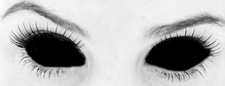
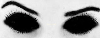
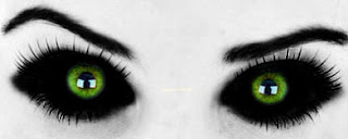
Click here for a direct link to a gif file of these image, which creates an illusion that she is blinking.

Wednesday, 19 October 2011

Protagonist profile photo ideas, dan, emily


With this first photo I simply changed the eye colour to a more intense green colour. The eyes are a key focus point to this photo so my aim was to try and draw as much attention to them as possible. From this idea I also darkened her eye lashes. however, I feel I wasn't getting the desired effect. After taking the focus off the eyes I then looked at the lips and wanted to create a bright red colour to stand out. After changing these few things I was disappointed with the look and almost scratched the whole idea. I came to the conclusion that I liked the eye colour and the style of darkening the eye lashes but it had to be more extreme for fit our film genre.  


These two last photos show the last stages of the final look I was going for. The photo on the left looked good and I loved the black and white style, whilst keeping colour still in the frame. However, I knew I wasn't totally happy with the photo. I still liked the eyes but still needed more focus and I felt the lips began to look tacky and unprofessional. So from this I knew I had to go further and really embrace horror and look at lots of other horror images to come up with the final look seen on the right. 

I blacked out all features I felt important and took out unneeded focus like the shirt. I felt once that was taken out it draws more attention to the face and was pleased with this idea. I also decided the black out the lips and only keep the colour in the eyes. I feel this works very well and was starting to creative my desired effect. The best part of this photo and the decision I was most happy about was the over-the-top make up added through the burn tool. After this was done I was really excited about the look of the photo and it started to reflect our genre and our film. Once I done this I then showed my group my work and asked others in the class several different styles of the  final photo with only small changes and the one you see on the right was the most popular photo and from this point will hopefully be used in out marketing for our film. Even if this is not used in our final coursework I will feel happy that I done it because I established a style and a look of our protagonist, also giving me an insight of the synergy that may be created through our film trailer and style that might be directly linked. -Dan.


After Dan showed is his edited protagonist profile, I decided to take one and play around with it myself. I took the paint brush tool, and shaded in the entire eyeballs of the profile. This automatically made the profile scarier, thus fitting in with the horror theme. Dan's edited black lips also add to this effect, and all the black areas, the eyes, eyebrows and lips, all coincide with each other. - Emily.

Monday, 17 October 2011

Music by Emily Fry-Sheehan.

Suspense is greatly needed within our teaser trailer, and sound plays a large part in this. As well as sound effects we need sounds and songs that greatly create tension.
Click here to hear a rising sound, classically used in many horror trailers that we hope to use for the last scene, before Lily turns around.

Other songs we have thought to use are:
Can't Hold On by Shiloh. We will use this at the very start of the trailer, as the first nine seconds before Shiloh starts singing, as it will define the genre of the film straight away. We will play this softly behind Noah talking.
I'm So Sick by Flyleaf, instrumental with no lyrics. We will use this when the trailer really kicks off into the rapid scenes, as it is fast pace, and fits in.

Sounds - Beki

We have decided on a car alarm going off as a distraction in the trailer  and therefore a sound which will be for grounded. I have been researching into a variety of car alarm sounds to discover which is most appropriate. Some are posted below...
1.

These videos can be converted into mp3 files and incorporated into the trailer in the editing process.

2.
This car alarm sound may be the least popular one as it's American and our film is British.

3.
This last one is not a car alarm sound but it can be credible as one if edited into the trailer successfully,

Filming Location Ideas - Beki

As a group we have been discussing various places for us to shoot our trailer. There will be scenes shot both indoors and outdoors therefore we need suitable outdoor locations for firstly the panning shot of Nora and Lily's new house/apartment/flat we have yet to decided whether this will be shot in the daytime of night time.
We have decided to include a second panning shot, this time it will be shot indoors and be of the room in which they do the ouija board among the darkness, lit only by candles. Towards the end of the trailer we have decided on a bathroom scene making specific use of a mirror and the reflections of both characters within it. It is important we require a good size mirror to achieve this shot.
Possible indoor locations which are available for us to shoot at is studio in Bournemouth although this possesses a problem of being able to travel there and back a number of time to shoot then re-shoot what is needed therefore we would prefer to find an alternative location which is more accessible to us.
As a last resort we have agreed to use the indoor space in one of our houses and this is a definite possibility.
There is a wide range of outdoor building we can shoot and pan of such as 'creepy' looking houses/buildings around us and one of our own houses we believe suits this look.
We will make final decisions on these locations nearer to the filming date.

Trailer Ideas, Emily Fry-Sheehan.

Here is one of our ideas for the trailer, in terms of visuals.

  • Open with a panning establishing shot of the couples new house, followed by another panning establishing shot of the room with the Ouija Board and candles, which is a second or two shorter than the previous first one.
  • Over these twos shots are the voice over of Nora saying something along the lines of "Don't worry, this is just for my film project, it's just a game".
  • We then snap to a handheld camera shot of Nora holding the camera pointed towards her own face in a bathroom, sorting out the focus etc, and you can see Lily over her shoulder and she looks extremely worried. She then says something like "I don't want to do this, what about what happened before, my past, what if it comes back". Nora then puts the camera on the side so you only see their waists, and they embrace and she tells her not to worry, that it's just a game, and whatever it was that was haunting her had left now.
  • The next series of shots is the pair using the Ouija Board with Nora's voice over reading the instructions of the board "you must blow on the glass at the end of the game to release the spirit". There are many shots of them using the board from different angles, perhaps a over the shoulder, birds eye view etc. In between these shots, text with pop up saying things like "this year", "based on true events" etc. The pace of this section will be quite speedy. It then comes to a halt for the next scene.
  • A car alarm goes of and they both jump up and leave the room to investigate. You then see the glass pull itself off the table and onto the floor. This is all from the handheld camera POV.
  • Then the pace really speeds up, with rapid different shots all next to each other, of Lily screaming, Nora running, doors banging, hallucinations etc. In between these shots, text comes up one word at a time of "it's" "only" "a" "game" "isn't it?". The "isn't it" will be the last one, and that will fade out.
  • It then cuts to a scene of Nora holding the camera, in a bathroom and you can see his reflection in the mirror. Lily is standing at the mirror with her head held down, breathing loudly, and you can see Nora approaching her in the mirror. He saying, "Lily? Lily?" over and over, and then when he reaches out and touches her shoulder, she turns around, and you get a full view of her face: Her eyes bloodshot, makeup everywhere, demonic eyes etc. 
  • The scene then cuts to text of the title "Through My Eyes Only" and "Coming this Halloween". Over that, you can here Nora's screaming.

Audience Profile - Beki

The type of audience we would expect to go and see 'through my eyes only' is a young, thrilling spectator who is interested in the genre of horror movies. There is no gender specific for this film, it appeals to both males and females. The female character in 'Through my eyes only' plays the heroine, this is different to most horror films where the female needs to be saved by a man, however this is not the case. After casting our two actors we felt there was a sex-appeal and this would attract both male and female audiences.

The audience age range would be from 15-24, they would primarily view the film in a cinema as we believe this film would be most successful if it were to be released around the Halloween period. It would be likely the audience members are in education such as school, college and university. They are an audience who like to be challenged by a mysterious narrative and like to involve themselves in popular culture.

The audience will also enjoy watching films like paranormal activity 1, 2 and 3 as these relate to the genre of our film. Perhaps they would also be interested in british horror, film like 28 days later.

Movie Poster Analysis, Emily Fry-Sheehan.

This is the movie poster for the film "Grave Encounters". It has several elements to it in which make it a very effective horror movie poster. It doesn't give that much away in terms of story line, for example, you have no idea of what the said proof is for, and you'll have to watch the movie to find out. The text itself doesn't give to much away either in terms of plot, but it gives you enough to feel the tension in the actual film itself.  By disjoining the sentence "They were searching for proof... They found it" at the ellipsis creates a dramatic pause. It makes you want to know what they found. The colours used are all mainly dark and shadowy, besides the text colour, and the main colour theme is green and black. The green makes the poster look like it is being shot in night vision, which tells you they will use that effect in the actual movie and trailer for it. This night vision effect makes everything seem creepy, and the black adds to that, as you don't know whats hiding within it. There are two people within this poster, a man in the foreground with a torch and camera, and a silhouette of something unknown to the audience so far in the background at the end of the hallway. The man is looking away from this silhouette, showing that he can't see it, and it could jump out on him at anytime, creating suspense that is shown in the trailer. The silhouette doesn't give anything away of what it actually is, and that makes you want to find out whatever it is, is. 
Overall I think this is a great movie poster as it gives you a taste of the film without giving to much away and it makes you want to find out more.

The above photo is that of the movie, "The Fourth Kind"'s poster. In contains someone being "abducted" by an alien, and they're rising above the bed. There is a small range of colours used, mainly only blue, black and white. The poster is framed with dark black shadows, drawing your eyes into the center on the poster, making it more intimate, and drawing your eyes to the man in the center. Above and below the man are articles of text which adds to this. The text itself says "There are four kinds of alien encounters. The fourth kind is abduction", then below it says "The Fourth Kind. Based on the actual case studies". By repeating the words "the fourth kind" twice, it gives the title itself more impact, and thus makes it easier to remember the name of the movie. The writing appears blurry and hazy around the edges, and in a font of what could be like a type writers, and this links in with the fact that it's based on actual case studies. As it is based around true events, this makes the whole idea of abduction more scary, and therefore in some audiences more appealing. The man in the poster is risen above the bed, with his arms twisted in agony, and it appears he is moving towards the lit up window. You can't see this mans face, nor what is abducting him. As you can't see he face, it could be anyone at all, and that makes you feel like you could be in that position as there is no actual identity. As you can't see the alien either, this allows your mind to wander and create an image of what it might be, thus making you want to find out what it actually is.


The above is a photo of "Paranormal Activity 2"'s film poster. The poster, like the other two is dark, with blues and blacks used. This film poster differs from the other two as it is spilt into vertical thirds, the outside two black. This greatly draws your eyes into the middle third image, which gives hints of what the film is about. It contains a dog and baby looking intently, the dog even barking, at whatever is in the doorway. By just looking at this, it creates suspense. This is because whatever is in the doorway is disturbing the two characters, and those characters in question are both seen as vulnerable, an infant and an animal. The image is in night vision, which is a classic creepy setting. The text above in the highest third states that the film will give you "sleepless nights", yet it doesn't actually give away what the story line is or what will happen. The film title is in the bottom third, and is hazy and blurry like that in The Fourth Kind's movie poster. Overall, this poster creates suspense as it doesn't give to much away, but enough to make you want to watch and find out.