Monday, 28 November 2011
Character Change, Emily, Dan
Our original plans for our teaser trailer included a male and female character, however due to complications, we had to rewrite the male character out of the trailer, as the actor could not attend filming dates. We then wrote in a female character to play the best friend instead of the boyfriend.
Shooting of Through My Eyes Only Photos, Emily
During the shooting of our teaser trailer, I took some behind the scenes photos and portrait shots of our two characters on my Nikon D3100.
Click here for a link to our Facebook page where you can see all the photos I took.
Click here for a link to our Tumblr page where I took a few selected images and wrote about them in detail.
Emily Fry-Sheehan.
Click here for a link to our Facebook page where you can see all the photos I took.
Click here for a link to our Tumblr page where I took a few selected images and wrote about them in detail.
Emily Fry-Sheehan.
Tuesday, 22 November 2011
Story Board - Beki and Dan
We have created a story board for our teaser trailer to help with the filming and production
page1

page 2

page3

page 4

Monday, 21 November 2011
Jump-Cut Discussion - Beki, Emily and Dan
As a group we have discussed in detail the content of our sequence of jump cuts which we plan to film for our trailer:
- Canted Angles
- Running (inside and outside)
- Crawling/dragging
- Close-ups - of facial expressions
- Screaming/crying
- Blood - close-up
- Hand-held camera shots - From Nora's POV
- POV shots - Nora and Lily
- Mirror reflections
Saturday, 19 November 2011
Title designs, Dan

This title design was the first idea and I was pleased with the scratched out font. What I dislike about this photo is that half of the knife is out of shot. Th knife is a key point of the mise-en-scene and isn't as effective with it not totally in shot.

This is my favorite shot because it includes both the text and the entire knife. Also you can pick up lots of detail on the knife, whilst keeping the scratched text within the shot. The feature that lacks within all of these photos is the intensity of the scratched title.

This shot was taken with a billboard poster in mind, it's wide and would fit the proportions of a billboard. What I found interesting about this photo is the dark contrast of the black and white effect. Because of this the dark handle of the blade really stands out. However, I feel there is wasted space in the top left corner.

This shot has a darker black and white tone and has more focus put on the title instead of the knife. It has a clean focus and the blade looks powerful. Because the attention is put the title with a close up it makes up for the scratch not being too clear.

This photo makes the most of the framing and is the best for having a balance between the knife and the title. I do like this photo but I don't think it has any use for posters and magazine covers.

This is the start of the darker style of these photos. This almost totally ignored the knife but it does create a great dark shadow below the title as if to underline it. Also because once again a close up the scratched out title stands out.

Due to depth of field the knife is blurred and the title is highlighted. This could potentially be used for a poster. Overall, I was really pleased with soft pine wood I used because I feel the black and white worked very well with the style of the grain.
Saturday, 12 November 2011
Font Ideas - Beki
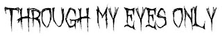
Below are some fonts I felt were possibly suitable to use for our teaser trailer title - Through My Eyes Only
 1. I personally like this font, I feel it is modern yet different although after asking members of my class, the majority felt it was not scary or chilling therefore this may not be the most suitable font to use.
 2. This font appears as if it was wrote out by a finger due to the smudges at the ends of letters. This could fit in well with our theme, and perhaps be edited so it would look like it was drawn in blood. However this is not the most scary of fonts, I think it works well.


3. The members of my class felt this font was chilling and I feel it fits in with the synergy of our film concept. It is clear to read and suits a horror genre.
4. This font is quirky and the letters are distorted, some letters are back to front and it is a mixture of upper and lower case letters. This suits the idea of the protagonist in our film/trailer, being encased by a spirit or unknown force, showing two sides of a personality etc. It was a popular choice with members of my class.
5. This font appears as if it has been scratched in, an idea we have discussed as a group. It is not the most chilling but it goes will with the idea of it being scratched into wood. An idea we would like to experiment further with as a group.
Tuesday, 8 November 2011

Monday, 7 November 2011
Font Ideas, Dan
Design Ideas for our Film Title - Through My Eyes Only

I like this font because it's quirky due to the 'e' in the font are backwards. By having something slightly different may help it's appeal and create attention. When I asked peoples opinion of these fonts no one chose this font as their favorite. The reason for this is that is doesn't portray the genre of our film well.

This font is extremely messy but this is both what I love and hate about this font. I like that it's messy because it looks like it has been scratched out by and knife but also because it's messy it's hard to read and wouldn't be very appealing for our audience. This font only got one vote by the people I asked so like the first font it won't be chosen.

This is possible my favorite font style because it has the messy scratchy look but at the same time is clear and easy to read. This didn't get the most votes when shown so I might have to re-look at these fonts and see which on suits out film the best.

When I first looked at this font I thought it was awesome but over time I'm starting to dislike it. I thought it was cool because it almost looks like it could have been written in blood once again like other fonts it isn't clear enough and might be hard to read. This font got no votes for this exact reason and I would have to agree and will definitely not be the font chosen for out film.
This was the favourite when shown to friends and my class by far. I do think it is a great font but I don't think it fits into the synergy of our film genre. I still think the third font is my favourite, I really like the idea that our font could be created by scratching it out onto a bit of wood with a knife. This is something I shall try and take a photo of and blog and see how effective the outcome is.
Font Ideas, Emily Fry-Sheehan
After searching on dafont.com, I found a couple fonts that I liked that are in the style of the genre for our movie trailer.

I like this font, yet I feel the "y"'s in each word are very dominating, and bring more attention to below the font that the actual font itself. One member of the class says this fits the horror genre the best.
I like this font, as it's very gothic, but I fee the words are to far apart, and I don't like the "n".

The class voted this as their least favourite, as they felt there was to much going on.
I like this font as it is strong, and the scratchy effect in the middle of the text is a nice touch.

The class overall liked this font the most, as they said it looks hand written. I have to agree with this, as it is my favourite as well. As it appears handwritten, it makes it more personal, linking in with the title and "my".
Design Ideas for eyes, Dan and Emily
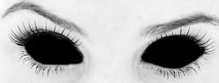
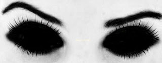
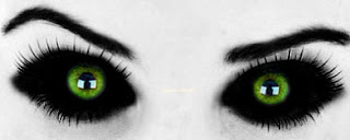

Click here for a direct link to a gif file of these image, which creates an illusion that she is blinking.
Subscribe to:
Comments (Atom)