Monday, 30 January 2012

Film Poster - Emily Fry-Sheehan


Here is my first official film poster design. After playing around with the idea of making a poster similar to the design of Paranormal Activity 2's poster in an earlier blog post, I have further developed the idea. I changed the photo from my first draft, seen here (bottom left), to one that I believe is more dramatic, thus more effective. I added the names of the actresses within the trailer in a rad font, that matches the font at the bottom of the poster, which states a the website. I mimicked the website idea from the actual Paranormal Activity 2 trailer. I changed the font of the trailer name to the official font of our trailer, which I downloaded from dafont.com. I also added a QR code, that when scanned, links to our youtube page. To make this poster, I used photoshop, and to create the black segments, I used the paint bucket tool to make one whole layer black. I then added another layer and placed the photo on that in the middle segment. 
I'm very pleased with the outcome of this poster, as I think it's very dramatic and captures the genre of the trailer itself.

Editing - Dan and Beki

As said in last weeks lesson we added the REC sign in, added opening credits and synced the music correctly. However this week we decided to take the music out for the last hand-held camera shot.
The video has been uploaded onto Youtube.com

Magazine front cover research - Beki

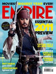
For some preliminary research for the front cover of a magazine, I have decided to view various existing front covers of the popular film magazine, Empire.


All these front covers are portrait and the main image covers the whole front cover, the photos have been taken with room around the edges or perhaps just on one side to incorporate text. This is something I will need to consider when creating the magazine front cover. I will create it on the program InDesign. The main image will be of the protagonist, Lily. 

Audience Feedback of Trailer Preview - Beki, Dan, emily

We have previewed our 3rd draft of the trailer to the rest of our class, once they had watched it, I (Beki) devised a series of 7 questions, printed them off and handed them out. we asked a number of them these questions to help us improve our work. The questions and answers are recorded below:

1. What did you think of the opening shots?
Person 1: Sets the scene, lets you know what it's about.
Person 2: They were good, didn't like the music.
Person 3: Awesomely lit, looks very cinematic. Good pace.
Person 4: The establishing shot is good.
Person 5: Blends in together well, candle shots very effective.
Person 6: I thought the shot with the ouija board was a bit too long, the suspense didn't really work.

2. What did you think was an effective aspect of the trailer?
Person 1: Ouija board moving.
Person 2: Transitions between shots.
Person 3: The trailer had progressive pace; starts slow gets faster. Good mixture of shooting style.
Person 4: The use of lighting makes it dark and ghostly.
Person 5:`The lighting is very effective for the genre.
Person 6: I liked the use of candles, candle light.

3. What do you feel can be improved?
Person 1: Music, more speaking parts.
Person 2: The ending.
Person 3: The music can be edited to suit the opening sequence more.
Person 4: Maybe slow music to begin with to build suspense.
Person 5: The music needs to blend in better.
Person 6: The last shot with the hand held camera filming and the girl in the mirror is a bit odd. You should probably be able to see her face, not very scary.

4. What did you think of the music?
Person 1: Started well. Random one part speaking.
Person 2: Did not like it, didn't go with theme.
Person 3: Works well for the "fast bit" but could be quietened or changed for the opening eerie shots.
Person 4: Should fade out for the mirror shot.
Person 5: Needs to blend more.
Person 6: A bit to intense, could start quieter and fit the mood more.

5. What do you think of the font?
Person 1: Good.
Person 2: I liked it.
Person 3: Works well.
Person 4: Good, it fits in but should be made larger.
Person 5: The font suited the trailer.
Person 6: I like the font, I think it works well with the atmosphere of the trailer.

6. Could you tell the mirror shot was video camera footage?
Person 1: Yeah.
Person 2: Yes.
Person 3: Yes, the REC looks convincing.
Person 4: Yes, the REC at the bottom and the camera in the mirror made it obvious.
Person 5: Yes the REC blinking in the corner gave this away.
Person 6: Yes, you could see the camera in the mirror obviously. You could of added a slight grain to make it more obvious though.

7.What did you think of the ending? Did you feel it was effective?
Person 1: Candle should go out after release date.
Person 2: No, I think it could of been better.
Person 3: Yes, possibly one of the strongest parts.
Person 4: Yes it leaves you wondering whats going to happen.
Person 5: Yes, but felt the music not blending together quite well changed the suspenseful atmosphere.
Person 6: Yes. I think the candle being blown put was a cool touch and could symbolise lots of things.

Overall the feedback we had received is positive, it has helped us decide on which features we can improve and which are strong aspects of our trailer.

Monday, 23 January 2012

Editing - Dan and Beki

This lesson we reviewed the trailer and felt the first 3 shots did not fit in with the rest of the trailer in regard to tone and colour scheme.
The first three are in daylight, and the rest are in the darkness, there is no clear transition between these and does not feel fluent. We also felt the second shot, which is a panning shot of the room, was unnecessary due to the red chair being a prominent feature yet not occurring in the rest of the trailer.

What did we do to solve the problems?


Firstly we removed the second shot as we decided the trailer was more effective and focussed without it.

We also decided to remove the third shot which is of the characters hugging, although it made sense to us, it would not make sense to the audience as the complete narrative is complicated and is unclear in just the trailer so we felt without it, it flowed more effectively.

We decided that the first panning shot of the house would look better if we edited the tone of the shot, we played around with the tint, exposure, and saturation to finish with an overall brown tone to this shot which fits in with the rest of the trailer which consists of brown tones due the use of candle light. because of the two deleted shots there is now a very effective transitions between the shots as they are both panning in the same direction, it fits perfectly.

Another change we have made is adding in text at the beginning of our trailer, to introduce it to the audience. We have included the studio name as well as text saying, 'From the director of Disturbed by Darkness'. The idea of this is to capture the audience's attention when they see the name of a film they have already seen which is similar of the genre to the trailer.

An idea which I feel will improve a problem we have (the mirror shot and people thinking it's a mistake) is to incorporate a recording image and/or a date and time etc in the bottom right-hand corner, to create the sense of real video camera footage and avoid members of the audience to be confused.

Finally this session the pair of us also corrected the music and ensured it was in time with the rest of the trailer.

The next step for us is to screen this version to our class then record and take on feedback to improve and produce the final version f the trailer for, 'Through My Eyes Only'.

Monday, 16 January 2012

Font decision - Beki

After experimenting with a number of fonts from Dafont.com and incorporating them into our trailer on iMovie we have all decided to use this font which we have downloaded from Dafont.com and saved to the computer, we can also use this for film posters and for the magazine cover. The font is clear and works well in the trailer as it is easily understood. The letters are at different heights therefore creates a distorted event and relates to the theme and genre of our trailer.

Monday, 9 January 2012

Font - DAN


This is a screenshot of a font change our title in our trailer which has shown to look awful. When looking at the font out of context it looked great but once put into the trailer it creates a blurred messy font that is unclear and unusable. We have leant from this and will be more careful when selecting the next font.