Indidious

There is a 5 star rating along with a comment and words such as 'sheer terror' are made bigger which stands out to the audience giving them a feel for the content of the film. Another way in which they have attempted to capture the audience's attention is referring to other famous and successful horror films which has been made by the same people; therefore bringing the audience along to their next film once they have recognized this film has been made by the same people who made their other favorite horror films.
Lastly I feel the tag-line works especially well with the image of the house and the boy, 'It's not the house that's haunted' once reading this the audience will automatically believe that it's the boy who is haunted, this is something that hasn't been focussed on in a film before and will be new to the audience and attract their attention. The title of the film is made clear, in the center third of the frame in block capitals: simple and effective.
Paranormal Activity

The rhetorical question makes the audience think about what else the film could involve, 'what happens when you sleep?'. The title is in red font and the largest piece of text to stand out: underneath this there is a short imperative sentence, 'don't see it alone', this all adds together and increases the amount of horror we believe this film entails.
The whole top third of the horizontal frame is used to show a quote from someone who is commenting on the film, this is longer than a usual quote and the audience would take time to read and think about it then review the rest of the poster.
One Missed Call
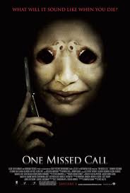
Personally I feel that this poster is potentially the most 'scary' as the background is completely back which accentuates the idea of darkness and being alone. The tag line is at the top of the frame which in the form of a rhetorical question and likely to be a question the audience have never thought of before and introduces the theme of the film.
The main and only image in the poster of only the face and hand of a made-up creature, with large black eyes and resembling of a human. The creature is holding a mobile phone to his ear which adds to the name of the film; 'one missed call'. The creature is something that is unique to this film only and it is clearly conveyed in the poster. The creature's face has been manipulated using photoshop or a similar editing program to make a woman's screaming mouth and nose, this has worked extremely well as it is not noticeable instantly as once time is taken to look closely which is subtle but effective. We do not know anything about the creature and how important it's role is in the film and this can be seen as a positive, as the audience will want to know what happens with this creature and the rest of the film.
The title is in block capitals and clear to read, it's presented in white font which stands out from the jet black background. Overall the poster is effective due to the simplicity and mystery of the creature.
No comments:
Post a Comment