Thursday, 29 March 2012

Evaluation Question 3 - Emily

Evaluation Question 4 - Beki

EVALUATION4FINAL
View more presentations or Upload your own.

Unfortunately the font which I used was unable to be read by 'slideboom' so here it cannot be seen. The font i did use was 'an unfortunate event', the same font used in our trailer, poster and magazine cover to create a synergy.

Monday, 26 March 2012

Evaluation Question 2, final. Dan, Beki and Emily


Here is our final take of evaluation question 2. We are happy with the content but if we had more time I think we would have addressed the problem of lighting and mistakes. The image is not as clear as we would have liked and this is because of the lighting. The problem with the lighting is that we needed it dark enough to make the projection clear but light enough to be able to see Beki and Emily. Also due to the amount of time we had to shoot this question it made it hard to get a clean shot without any mistakes. But because there was mistakes and we didn't have the time or the empty room I had to attempt to edit together the mistakes to try and create some sort of continuity.

Our Facebook Page - Beki

Here is a link to our Facebook page: http://www.facebook.com/groups/196682180405185/

Sunday, 25 March 2012

Thursday, 22 March 2012

Film Poster - Beki

After completing my magazine cover I wanted to experiment with creating a film poster, although we already have our final poster I wanted to have a go myself at making this style of product. Below is the final draft:

I decided to use one of our initial images to create this poster due to the room either side of her for text. The name of the movie is obviously the largest, it is is the same font we have used throughout to create a synergy, I also decided to add a drop shadow on InDesign to create a dark and spooky effect. This is the same for the tagline 'the vision is real'. To interact with the audience I have created a QR code which links you to the Youtube trailer as well as incorporating the name of the movie's website, the white font colour stands out against the darkness of her clothing, but due to the white detail on it I added a black stroke to make it stand out.
For the 'coming soon' I wanted to take up some space so it wasn't too blank on one side so I had the idea to type it horizontally which introduced some variety into the poster. I feel this is effective and it is still easy to read, I also added a white stroke to make it bolder and to stand out more.

Tuesday, 20 March 2012

Final Magazine Cover - Beki

After reviewing the opinions from my audience feedback task I have made some improvements to our final draft of the magazine cover.
 Here is the final cut:
This has come along way from the previous draft. I have incorporated the colour yellow, to create a colour scheme of red and yellow: it is less dark than the previous cover although I feel it looks more professional and stands out much more. I have corrected a spelling mistake I did not initially notice. I also changed the plus sign to yellow, to make it look like less of a cross and more of a plus sign: after asking a number of people, they all agree it looks more credible as a plus sign. To make the 'This years scariest horror movie?' part stand out more, I changed the colour to red and added a black stroke, making the word 'scariest' slightly italic to create an impact on that particular word.
I am really pleased with the names of the other movies, they are in alternate colours, red and yellow, both with a black background which highlights them; i also changed the font to American Purpose which I downloaded from Dafont.com, this looks much more professional than the previous font and colour. 
I felt the cover looked a bit blank and that there was not enough cover stories on there, most existing covers are packed with engaging stories and news. I wanted to add to mine by incorporating an, 'Apocalypse Now' feature, this movie is from decades ago and will appeal to those who have an interest in this type of film as well as creating new fans of the film, after reading this article. I decided to more the plug and make room for this story and cover more of the space at each side.
I have improved the overall look of the plug, changing it from a review of 2012 to more particular films. I made the film yellow to stand out and add some colour variety to the before very plain plug. I also changed the font to a serif stye, as I have seen this successfully on Empire magazine and wanted to convey my inspiration. I feel overall it is much more exciting and professional looking.
Lastly I added an issue number as well as the price in dollars, I have seen this in many magazines as well as movie magazine and thought this would add to the authenticity of the cover, making it more realistic.

Feedback
I have asked a number of my piers some questions about this cover compared to the previous one and these are some of their comments; 'I really like the plus section, the black background with the writing makes it stand out', 'the kingdom title looks so professional, like a real magazine.' 'I love the synergy of the title, through my eyes only, especially the font and overall scary style'. And 'the plug looks so much better! something I can imagine seeing this in a real magazine'.


Monday, 19 March 2012

Final Magazine Cover - Emily

This is my final draft of my magazine cover. I have added a blue plug, giving information on an upcoming movie release. I have also added text about other movies featured inside, and names of people who won awards in the Oscars. This makes the magazine seem more professional and realistic to the audience. I mainly used yellow and reds, and blue in the background of the plug to stand out against her dark hair and the white background in the cover photo.
At the bottom of the cover, I added a banner about a Horror special. I used a horror like font, and made the colour of it green to add to the horror genre. 
I also moved the bar code to make way for the banner, and added a date and price to the left of it.

Thursday, 15 March 2012

Magazine cover design, dan


This is my magazine cover design. I started the cover by making the original photo black and white and darkening down the models hair. I done this for two main reasons, it makes the magazine have an artistic but Gothic style and the other reason is that I like to change most photos into black and white because I think it looks cool. The problem with doing this is that the magazine cover instantly becomes drained and not as eye catching as the magazine cover should be. From this I knew I would have to bring in some bright colours to make it stand out. As you can see I chose red and yellow, both I feel really 'pop' and stand out. Even though I done this I wasn't going to go mad, I wanted to still keep it dark and mysterious. The fonts are subtle but clear and the use of framing and boxing has overall started to create a more professional look. If I had more lime I would focus more on a better title font and title colour, possibly changing the format and structure of the tag lines as well. I think that the photo is key in every magazine cover and the best part of mine is definitely the photo and I can thank Emily for that. With the Photoshop effects and general style I have decided I'm pleased with my final design.

Magazine Covers - Audience feedback - BEKI

After completing both of my magazine covers I have devised a questionnaire to give to members of my class: this will determine which cover is the most successful/effective from the audience feedback as well as which one I will use.


The questionnaire looked like this:
<Cover A
Cover B>
-Which cover do you initially prefer?
Why?
-Do you think they are credible as movie magazines?
Why?
-Do you think the image is effective?
Why?
-Do you feel the fonts used are effective?
Why?
-What do you think of the colour schemes and why?
-What did you like about your favourite cover?
-How do you feel it could be improved?

Feedback
Out of all the feedback I received it turned out cover B was the most popular: reasons for this is are, 'it looks more professional','the image is more professional looking' and 'the image is more interesting. It is believed that the cover has an 'authentic conventional look' and there is an 'element of mystery'. Peoples comments about cover A are, 'The image fills the frame therefore looks more professional', 'the person is making successful eye contact with the camera' and 'I like the colour schemes, it is not too dark like cover B'. I was given ideas on how to improve cover B such as, 'the font for the list of films could be be striking', 'the "this years scariest horror movie?" could stand out more' and 'the plus sign looks like a black cross, could be misleading'. 


Next Steps
I have taken this feedback on board and will now make improvements based on the feedback and my own ideas resulting in the final draft of our magazine cover.

My 2nd Magazine Cover - Beki

This is the second magazine cover I have created, I feel the style of this one is different from the previous one mainly due to the image. I edited this image on photoshop by decreasing the saturation and adding a spotlight glow. I have kept the same words and title from the previous draft there I have used a different font for the main story text, I feel this is more sophisticated therefore this front cover could be aimed at an older audience. The image itself is different as the subject is facing sideways and she is screaming, bringing in an element of her character which connotes the type of film 'through my eyes only' is. This factor would persuade people to buy this magazine and find out more about the film. I prefer this shade of red to the one in my previous magazine cover, it more of a 'blood red' as opposed to an orangey red. This shade if more striking and suits the red and black theme of darkness/horror.

Magazine Cover, Final Draft - Beki

 This is my final draft of my magazine front cover. After having some technical difficulties with InDesign, I eventually over came these and have completed a final draft. Due to not having photos I needed in time from another group member, I feel I have completed a credible and professional looking front cover, although the image is not what I initially wanted to work with. Now some more suitable images have been taken, I will attempt to create a front cover with one of those.  I have kept a colour scheme of red/white/blue and aspects of black. This was to create a sense of horror/dark feel for this issue. I decided to use the blue so it would stand out, it also goes quite well with the red and white.
Aspects of the front cover which I have added from the previous draft are: drop shadow on title, rotation of bar code, more cover stories, change of font and text angle in plug.

Monday, 12 March 2012

Evaluation video, Beki, Emily and Dan

This is a short video of us practising the presentation of one of our evaluation questions. This was a helpful task that allowed us to know what we want to include in our evaluation and what to leave out. We were happy with the set up and presentation but the description needs more attention. Hopefully from this we'll be able to make our final evaluation look professional.  

Magazine First Draft - Emily

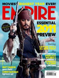
Here is my first draft of making a magazine cover featuring our film. I decided to call the magazine "Kingdom" as it is similar to the film magazine "Empire", and I used a couple of covers of Empire as inspiration for my cover. The font I used for the title is called Slant, which I downloaded from dafont.com. I added a puff saying "2 covers to collect", as synergy to Beki's designed magazine cover. The font I used is Lane A. I then added our movie's title in the same font used in the poster and the trailer, called An Unfortunate Event, which creates synergy and linked them all together. I then added an exclusive plug and some text to give the audience more information on the movie, and hints towards the genre. The actual photo on the magazine cover I edited Soraya's eyes completely black, to show the horror genre. I also added a bar code to make it look more like a magazine. I made this on InDesign.

Photos - Emily.

I took some more photos of Soraya, as we needed more photos appropriate for another magazine cover. I took these photos on a Nikon D40. Here is a Tumblr blog post where you can see some of  my favourite photos out of the set I took. Click on the photos to make them larger.

Click HERE to see the blog post.

Monday, 5 March 2012

Magazine Front Cover, 2nd Draft - Beki


This is a copy of my second draft of the magazine front cover. To complete a final draft I would like to finish adding in the cover stories as well as other smaller details to enhance the credibility of this front cover. I decided to include a story concerning the Oscar's as this was a recent event and a popular theme in movie magazines.

To improve on the initial draft I decided to edit the plug, I went with a blue/purple colour so it stood out, like a plug should. I went with the number 50 as opposed to 30 as it's higher and more eye-catching.

I like the use of the line separating the main cover story from the other, smaller stories. I have not seen this on existing magazine front covers however I decided to go with my idea and see how a final draft looks. Once completed I will show this cover to members of the potential audience and gather feedback, if I feel this is not a successful idea then I will change it.

Green band and Credits creation, Dan


The green band and the credits have been made to create authenticity and to give the trailer a sense of professionalism. Making the green band was easy to make because I simply just copied the format of a real green band. However, making the credits was extremely time consuming. Firstly, the credits took up a lot of time because of the constant changing and moving of the fonts and format. Designing the companies associated with the trailer is what took up the majority of the time, making them look unique professional and realistic.  

CBS Outdoor poster - Emily

Using the website CBS outdoor, I was able to put this version of our poster:
onto a London Underground billboard. Click this here to see the video with the poster on display.

Magazine Title Ideas - Beki and Emily

I have decided to create a new name of a magazine for the front cover.
Below are some names which I am considering.

  • Film Now
  • Utopia 
  • Kingdom
  • Just Movies
  • Franchise 
  • Shoot
We have decided to you "Kingdom" as our magazine title, and it took inspiration from the well known film magazine "Empire".

Monday, 27 February 2012

Front Cover 1 - Beki

Here is my first and unfinished draft of my front cover for a film magazine:


I decided to use this photo because it was the only suitable one which we already had. I have made plans to  take more photos of the protagonist, keeping in mind that they will be used for the front cover of a magazine. 
The name of the magazine came from a brain storm of ideas within out group, we wanted the name to connote strength and knowledge of the film/movie industry and we felt the name, 'Kingdom' portrayed this effectively. 
I have attempted to create a colour scheme but this will be more evident as the poster is nearer completion. I have included a plug to gain attention and replicate features of a professional magazine.

For my second draft I would like to add a banner or more text at the bottom of the image. I will also include a date, price and bar code as well as other features which are typical of a magazine front cover.

Production company designs, Dan


These are two production company designs I have created to put into our film trailer. They will be placed at the beginning of the trailer to help give the effect of a real and professional trailer. These may also be used in other parts of the project to help create a synergy between all aspects of our project and trailer.


Monday, 20 February 2012

Film Poster Feedback - Emily

I handed out photos of each of our film posters, and asked people opinions on them:

The top poster was this one:
This was the bottom poster:


Which film poster is your favourite? Top or bottom?
Person 1: Top.
Person 2: Top.
Person 3: Top.
Person 4: Top.
Person 5: Layout of bottom but picture and quotes from the top.
Person 6: Top.

What do you like about it?
Person 1: Faint ouija board.
Person 2: Colours, overlayed images, the title looks better on two lines instead of three.
Person 3: I like the ouija board in the background because it relates to the trailer well.
Person 4: Overlay of ouija board on top of girl image.
Person 5: Love the halve colour text linked with background of image.
Person 6: More threat, less like a DVD cover.

Do you think the posters portray the horror genre well? Which one does is it better?
Person 1: Yes, font & imagery, good top one!
Person 2: Top because of the colours and the girl looks scarier.
Person 3: They both portray horror well with the colour and images.
Person 4: Top, because picture is scarier and colour scheme.
Person 5: The bottom one, dark colours make it eerie.
Person 6: Yes.

Do you like the text used?
Person 1: Yes, like how they overlap.
Person 2: Yes.
Person 3: Yes, very fitting for the genre.
Person 4: Yes.
Person 5: Yes.
Person 6: Yes.

If you saw these posters, would you want to go see the film? Which one is more effective?
Person 1: Top one more effective. I would!
Person 2: Top. It looks more like a film poster.
Person 3: I would see the top one because it tells you more about what you are going to be watching with the ouija board.
Person 4: Top one, yes.
Person 5: Top one, yes. Because bottom one doesn't tell you anything.
Person 6: Could the top one work with a big close up?

Monday, 6 February 2012

Film Posters 2 - Emily


This is my second poster idea, however this is unfinished, as I need to add a review and film certificate. I used a photo of Megan rather than Soraya in this poster. I turned the image black and white and then I added a new layer. To that layer, I applied a lens blur. I then changed the opacity to make the image clearer. I then clicked layer mask, and with the brush tool, after I'd lowered its opacity and flow, I highlighter her eyes to make them stand out. I then made this whole image a new layer, and added a block of black to the left hand side. I then put the text in the top right corner, near hers eyes, making her eyes and the word "eyes" in the title have a connection. I made half the text grey and half black, and that created a sort of mirror effect that I love. I then added the tag line below.

Magazine Cover Photos - Beki

After reviewing the photos we currently have taken from the video shooting, I have decided we do not have any suitable images to use for the front cover of the magazine. As a result of this we need to re-shoot some images and this is on our agenda.

However I have edited one existing image which I feel perhaps could work well as a magazine cover.

I used the Burn tool to add definition to her eyebrows, I also used this tool on the bottom of her eye to make it appear as if she has eye-liner one. I then used the same tool but on a less intense level to create an effect of darkness beneath her eyes, this effect makes her look gaunt and inhuman. Lastly I adjusted the saturation and lightness to make the photo look more professional.

Editing 2 - Beki

After previewing our trailer to the rest of the class, we noticed many people commented on the music: some people felt it did not fit in well with the genre and others said it was effective yet too intense from the beginning.
We have decided to make the music quieter at the beginning, making the trailer much more eerie at the start, when the action kicks in it is much more scary.
Another aspect which people commented was the ending where the candle gets blown out, it was not instantly obvious that the candle was blown out at the end, so we decided to add back in the sounds of the candle being blown out. When we had done this the sound effect was very effective and it fitted well with the other music.
We new feel the music is complete and makes the genre clear to the audience.

Wednesday, 1 February 2012

Glass movement set-up, Dan


Firstly, the set up is simply a wooden chair, a gorilla tripod, a Ouija board, a glass and Blu-Tack. From the photo above the tripod is placed at the top of the chair. Then the Blu-Tack is used to keep the board stuck to the chair.


After the lighting was correct and the set up was established I then mounted the camera to the tripod. Seen from a reconstruction above I then picked up the chair and tilted and moved the chair about. As a result the glass then stared to seemingly move by itself. The reason why this works is that because the camera is mounted to the chair, the movement of the camera was perfectly synchronised with the movement of the glass, evidently giving the glass the effect of complete independent movement.     

Monday, 30 January 2012

Film Poster - Emily Fry-Sheehan


Here is my first official film poster design. After playing around with the idea of making a poster similar to the design of Paranormal Activity 2's poster in an earlier blog post, I have further developed the idea. I changed the photo from my first draft, seen here (bottom left), to one that I believe is more dramatic, thus more effective. I added the names of the actresses within the trailer in a rad font, that matches the font at the bottom of the poster, which states a the website. I mimicked the website idea from the actual Paranormal Activity 2 trailer. I changed the font of the trailer name to the official font of our trailer, which I downloaded from dafont.com. I also added a QR code, that when scanned, links to our youtube page. To make this poster, I used photoshop, and to create the black segments, I used the paint bucket tool to make one whole layer black. I then added another layer and placed the photo on that in the middle segment. 
I'm very pleased with the outcome of this poster, as I think it's very dramatic and captures the genre of the trailer itself.

Editing - Dan and Beki

As said in last weeks lesson we added the REC sign in, added opening credits and synced the music correctly. However this week we decided to take the music out for the last hand-held camera shot.
The video has been uploaded onto Youtube.com

Magazine front cover research - Beki

For some preliminary research for the front cover of a magazine, I have decided to view various existing front covers of the popular film magazine, Empire.


All these front covers are portrait and the main image covers the whole front cover, the photos have been taken with room around the edges or perhaps just on one side to incorporate text. This is something I will need to consider when creating the magazine front cover. I will create it on the program InDesign. The main image will be of the protagonist, Lily. 

Audience Feedback of Trailer Preview - Beki, Dan, emily

We have previewed our 3rd draft of the trailer to the rest of our class, once they had watched it, I (Beki) devised a series of 7 questions, printed them off and handed them out. we asked a number of them these questions to help us improve our work. The questions and answers are recorded below:

1. What did you think of the opening shots?
Person 1: Sets the scene, lets you know what it's about.
Person 2: They were good, didn't like the music.
Person 3: Awesomely lit, looks very cinematic. Good pace.
Person 4: The establishing shot is good.
Person 5: Blends in together well, candle shots very effective.
Person 6: I thought the shot with the ouija board was a bit too long, the suspense didn't really work.

2. What did you think was an effective aspect of the trailer?
Person 1: Ouija board moving.
Person 2: Transitions between shots.
Person 3: The trailer had progressive pace; starts slow gets faster. Good mixture of shooting style.
Person 4: The use of lighting makes it dark and ghostly.
Person 5:`The lighting is very effective for the genre.
Person 6: I liked the use of candles, candle light.

3. What do you feel can be improved?
Person 1: Music, more speaking parts.
Person 2: The ending.
Person 3: The music can be edited to suit the opening sequence more.
Person 4: Maybe slow music to begin with to build suspense.
Person 5: The music needs to blend in better.
Person 6: The last shot with the hand held camera filming and the girl in the mirror is a bit odd. You should probably be able to see her face, not very scary.

4. What did you think of the music?
Person 1: Started well. Random one part speaking.
Person 2: Did not like it, didn't go with theme.
Person 3: Works well for the "fast bit" but could be quietened or changed for the opening eerie shots.
Person 4: Should fade out for the mirror shot.
Person 5: Needs to blend more.
Person 6: A bit to intense, could start quieter and fit the mood more.

5. What do you think of the font?
Person 1: Good.
Person 2: I liked it.
Person 3: Works well.
Person 4: Good, it fits in but should be made larger.
Person 5: The font suited the trailer.
Person 6: I like the font, I think it works well with the atmosphere of the trailer.

6. Could you tell the mirror shot was video camera footage?
Person 1: Yeah.
Person 2: Yes.
Person 3: Yes, the REC looks convincing.
Person 4: Yes, the REC at the bottom and the camera in the mirror made it obvious.
Person 5: Yes the REC blinking in the corner gave this away.
Person 6: Yes, you could see the camera in the mirror obviously. You could of added a slight grain to make it more obvious though.

7.What did you think of the ending? Did you feel it was effective?
Person 1: Candle should go out after release date.
Person 2: No, I think it could of been better.
Person 3: Yes, possibly one of the strongest parts.
Person 4: Yes it leaves you wondering whats going to happen.
Person 5: Yes, but felt the music not blending together quite well changed the suspenseful atmosphere.
Person 6: Yes. I think the candle being blown put was a cool touch and could symbolise lots of things.

Overall the feedback we had received is positive, it has helped us decide on which features we can improve and which are strong aspects of our trailer.

Monday, 23 January 2012

Editing - Dan and Beki

This lesson we reviewed the trailer and felt the first 3 shots did not fit in with the rest of the trailer in regard to tone and colour scheme.
The first three are in daylight, and the rest are in the darkness, there is no clear transition between these and does not feel fluent. We also felt the second shot, which is a panning shot of the room, was unnecessary due to the red chair being a prominent feature yet not occurring in the rest of the trailer.

What did we do to solve the problems?


Firstly we removed the second shot as we decided the trailer was more effective and focussed without it.

We also decided to remove the third shot which is of the characters hugging, although it made sense to us, it would not make sense to the audience as the complete narrative is complicated and is unclear in just the trailer so we felt without it, it flowed more effectively.

We decided that the first panning shot of the house would look better if we edited the tone of the shot, we played around with the tint, exposure, and saturation to finish with an overall brown tone to this shot which fits in with the rest of the trailer which consists of brown tones due the use of candle light. because of the two deleted shots there is now a very effective transitions between the shots as they are both panning in the same direction, it fits perfectly.

Another change we have made is adding in text at the beginning of our trailer, to introduce it to the audience. We have included the studio name as well as text saying, 'From the director of Disturbed by Darkness'. The idea of this is to capture the audience's attention when they see the name of a film they have already seen which is similar of the genre to the trailer.

An idea which I feel will improve a problem we have (the mirror shot and people thinking it's a mistake) is to incorporate a recording image and/or a date and time etc in the bottom right-hand corner, to create the sense of real video camera footage and avoid members of the audience to be confused.

Finally this session the pair of us also corrected the music and ensured it was in time with the rest of the trailer.

The next step for us is to screen this version to our class then record and take on feedback to improve and produce the final version f the trailer for, 'Through My Eyes Only'.

Monday, 16 January 2012

Font decision - Beki

After experimenting with a number of fonts from Dafont.com and incorporating them into our trailer on iMovie we have all decided to use this font which we have downloaded from Dafont.com and saved to the computer, we can also use this for film posters and for the magazine cover. The font is clear and works well in the trailer as it is easily understood. The letters are at different heights therefore creates a distorted event and relates to the theme and genre of our trailer.

Monday, 9 January 2012

Font - DAN


This is a screenshot of a font change our title in our trailer which has shown to look awful. When looking at the font out of context it looked great but once put into the trailer it creates a blurred messy font that is unclear and unusable. We have leant from this and will be more careful when selecting the next font. 


Font Change - Dan + Beki

After reading the feedback from our questionnaires and including our own opinions we have decided to re-think and change the font.
Firstly instead of using two different fonts we will only use one to keep it the theme and create a synergy.
We are looking to use a font which clearly illustrates the genre and style of our genre as well as an eye-catching font which possibly resembles hand writing. This will then be changed and added into our trailer instead of our existing fonts.

Another decision we have decided it to take out the 'this year' part of the text as it did not flow with the second part of the text. We felt, "it's only a game isn't?" is more effective.

Audience Feedback - 1st Draft BEKI

After completing our first draft of our trailer I devised a short questionnaire to ask members of our class for their feed back and opinions.

Here are the results.


  • 1. What was the overall impact of the trailer?
Person 1: "I felt the trailer created suspense and was thrilling"
Person 2: " It reminded me or Paranormal Activity, it was also scary"
Person 3: " Dark, mysterious and creepy"
Person 4: "Fast and intense"
  • 2. Were you aware of the genre/style of the trailer?
Person 1: "the trailer clearly established the genre by the use of low lighting, candles, and screaming"
Person 2: " Yes"
Person 3: "I could see it was a modern horror film"
Person 4: "Yes, its teen horror".

  • 3. What did you think of the font?
Person 1: " I think the font could be changed into a more suitable font which suited the genre. It was basic and did not fit the genre that well"
Person 2: " gothic and bold"
Person 3: " I didn't like the font of the captions, i felt it was too plain and think, I'm also not a great fan of the title font"
Person 4: "It could be creepier, but it wasn't bad".
  • 4. What did you think of the editing?
Person 1: "the editing was fast paced and I liked the transitions between shots"
Person 2: " It was effective and fast"
Person 3: " Generally effective although I thought the opening shots were too slow particularly liked the ending"
Person 4: "Yeah it was good, cut together very well, like a music video, it's progressive".
  • 5. What did you think could be improved?
Person 1: "firstly the font could be improved I also thought the narrative was unclear in certain parts."
Person 2: " The first scream should be longer as it cut away too quickly"
Person 3: "I think I need to identify with a character because i don't have someone to identify with, it's a little too general"
Person 4: "Show other characters more, other than the crazy lady".
  • 6. What did you think of the opening?
Person 1: "The opening was good as it created atmosphere and a sense of foreboding"
Person 2: " A good contrast between the change and day to night, the mood rapidly changed and I was not expecting this"
Person 3: "It was okay but I couldn't hear it, it may be better with the sound up so I could get the sense of foreboding."
Person 4: "Good, good use of props, but some focus issues".
  • 7. What did you think of the ending?
Person 1: "The candle blowing out is effective and I think it will be great with sound"
Person 2: " It makes me want to see more and find out what happens next"
Person 3: "Tremendous!"
Person 4: "Good pinnacle".

  • 8. What did you think of the mirror shot?
Person 1: "At first I thought the mirror was accidentally in shot but once the idea was explained to me I thought it was effective although initially this was unclear to me."
Person 2: "I could tell the use of the mirror was intended in the trailer, I felt it was successful"
Person 3: "first time i saw it, it threw me because i wasn't prepared for someone to be filming in the film. But it's an effective shot although I do think the girls reaction needs to be worked on a little bit."
Person 4: "At first it seemed out of place, but the reveal fixes it, so yeah it was good."