We have created a blog via Tumblr specifically for photos which related to the making of our trailer such a possible filming locations etc.
CLICK HERE TO VISIT THE PHOTOGRAPHY BLOG
Monday, 10 October 2011
Thursday, 6 October 2011
Facebook Group, Dan
We have created a Facebook group to help communication within the group and help organise meetings and shooting. we will also be creating a Facebook page for our film to create buzz and to attempt viral marketing.
(Click for link to Facebook group)
(Click for link to Facebook page)

(Click for link to Facebook group)
(Click for link to Facebook page)

Film poster deconstructions, Dan
American Psycho Poster

Firstly, there is a representation of split personality showing that there might be another side to Patrick. This is not the most obvious representation to pick up but its definitly powerful even though it maybe subtle. This is shown by another image of Patrick in the blade. Not only does it show a separate version of him but more importantly Patrick is facing the opposite direction. The fact that they are facing two different directions depicts separate views, lifestyle and personality. One feature that does stand out is the contrast of a clean cut man in a professional suit wielding a blade. This symbolises that this film maybe strange and follow unexpected trends and topics. Also another contrasting feature of this poster is how it shows text saying 'monsters are real'. The 'real' in the poster is juxtaposed with the contrasting image of the poster being like a painting or a drawing instead of a 'real' photo. Also the 'real' may give the spectator and insight to the narrative, showing that realism and fantasy may be an underlining path within the narrative. Uncharacteristically the poster is extremely clean breaking stereotypical ideologies of murders and psychos. Once again giving the audience an idea of what Patrick maybe like. The title is interesting, I feel the two different font types once again represent the two different sides of Patrick. This poster is full of symbolism and I feel because of that it is very effective. For that reason I will use this influence on our own posters for our film.
Creep

This poster is a lot more in keeping with its genre compared to the American Psycho poster. This may be because the genre is a lot more clear cut and understandable. What I personally love about this poster is how gritty and realistic it feels when looking at it. The dirty and dark colours used in this poster shows an insight into the grim and disturbing narrative. Also an enigma code is introduced, visually we see a hand pressed against the train window with blood added as well. Because the spectator cannot see who that person is or what's going on it creates question and interest. This therefore draws the audience into the film and gets people thinking about the film. This then creates a relationship with the spectator involving the audience within the film. Another fascinating feature of this poster is the red light on the end of the train. I feel this makes it look like a face, a face of a creature. This may seem strange but it does link into the antagonist in this film. The title on this poster has a cool effect however, I feel it looks a bit bland and doesn't stand out a lot and too much of the focus it put on the train. I do think this is an okay poster but I feel that there are much better posters and I wont be using too much influence from it.
Hostel

This is a poster I feel is lacking some what, the style seems lazy and simplistic. I feel the best USP (unique selling point) is the fact that Quentin Tarantino is mentioned. The idea of the narrative is clear from the imaging of a person strapped to a chair and the theme colour being a dark red. This I guess is a good representation of violence and pain. The title blends into the background and doesn't stand out and no clear connection is made with the audience. Although I was disappointed with this poster it has made it clear to me that I don't want to base my poster around this design or idea. I guess what is does do well is vividly show what the audience will be getting themselves into, not in a predictable way but in an easily understandable style and genre of film.
Monday, 3 October 2011
Film Posters - Beki
Indidious

There is a 5 star rating along with a comment and words such as 'sheer terror' are made bigger which stands out to the audience giving them a feel for the content of the film. Another way in which they have attempted to capture the audience's attention is referring to other famous and successful horror films which has been made by the same people; therefore bringing the audience along to their next film once they have recognized this film has been made by the same people who made their other favorite horror films.
Lastly I feel the tag-line works especially well with the image of the house and the boy, 'It's not the house that's haunted' once reading this the audience will automatically believe that it's the boy who is haunted, this is something that hasn't been focussed on in a film before and will be new to the audience and attract their attention. The title of the film is made clear, in the center third of the frame in block capitals: simple and effective.
Paranormal Activity

The rhetorical question makes the audience think about what else the film could involve, 'what happens when you sleep?'. The title is in red font and the largest piece of text to stand out: underneath this there is a short imperative sentence, 'don't see it alone', this all adds together and increases the amount of horror we believe this film entails.
The whole top third of the horizontal frame is used to show a quote from someone who is commenting on the film, this is longer than a usual quote and the audience would take time to read and think about it then review the rest of the poster.
One Missed Call
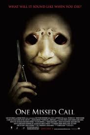
Personally I feel that this poster is potentially the most 'scary' as the background is completely back which accentuates the idea of darkness and being alone. The tag line is at the top of the frame which in the form of a rhetorical question and likely to be a question the audience have never thought of before and introduces the theme of the film.
The main and only image in the poster of only the face and hand of a made-up creature, with large black eyes and resembling of a human. The creature is holding a mobile phone to his ear which adds to the name of the film; 'one missed call'. The creature is something that is unique to this film only and it is clearly conveyed in the poster. The creature's face has been manipulated using photoshop or a similar editing program to make a woman's screaming mouth and nose, this has worked extremely well as it is not noticeable instantly as once time is taken to look closely which is subtle but effective. We do not know anything about the creature and how important it's role is in the film and this can be seen as a positive, as the audience will want to know what happens with this creature and the rest of the film.
The title is in block capitals and clear to read, it's presented in white font which stands out from the jet black background. Overall the poster is effective due to the simplicity and mystery of the creature.
Character Profiles, Dan
Character One
Name: Nora
Gender: Female
Age: 19
Height: 5ft 6"
Build: average
Appearance: Long dark hair with pale toned skin. Dark eyes and is stylish.
Interests: Loves music, she plays guitar but her real passion is film making.
History: A 'normal' life growing up in the city and meets a girl a film school that she instantly clicks with.
Aspirations: She has always had aspirations within the music industry but once again her love is for film and would love to be a huge Hollywood director.
Fears: fears living his entire life as a nobody.
Character two
Name: Lily
Gender: Female
Age: 19
Height: 5ft 8"
Build: slim
Appearance: dark long hair, stylish but withdrawn clothing.
History: A mysterious and unknown history
Aspirations: She aspires to be a writer, writing for films is something she has always wanted to do.
Fears: that her past memories will once again come back into her life.
Sunday, 2 October 2011
Trailer analysis, Dan
American Psycho - Mary Harron
Cinematography: There are a lot of close up shots within this trailer, these close ups are used so the audience can get idea to who the protagonist is. These close up shot reveal a lot about the character and also shows how character driven the film will be. For example, there is a shot of Patrick pealing off a face mask whilst looking into a mirror. This close up allows the audience to see that Patrick is a harsh and concealed character. The interesting part of this shot is how he is pealing off a face mask. To me this represents a separate side to himself and side of himself he has to hide and cover up with a mask. Having seen the film I can say that this is a valid analysis of this shot. Shots like this inspires me to do something similar within our film. It could be a clever tool to add a stylish look to the cinematography.
Editing: The editing in this trailer shows no long drawn out shots, the editing is fast paced with many close up and medium shots. There next to no continuity editing in this trailer, the editing in this trailer is for affect and shows this throughout the trailer. The editing also cuts between 'normal' life and vial and vicious shots which once again represents the separate life he has compared with his 'normal' life.
Sound: Sound is the most interesting part of this trailer and is the main reasons why I have used it as an example. I love how this trailer has used the happy non-diegetic sound contrasted with the horrific images and horrific diegetic sound from the killings. This feature has fascinated me and I would love to use it in our own trailer even if its only for a little part of the trailer. A part from this every other sound is drowned out even when you see a shot with clear sound, once again I think this is an impressive style. Hopefully we can achieve this within our trailer.
Mise-en-scene: The mise-en-scene in this trailer gives an insight into the sickness of this film through the blood soaked bodies etc. An important piece of mise-en-scene is the suits and business style seen on pretty much all the men in the trailer. This shows that the blood lust shown in the trailer has come from the professionalism from businessmen in wall street. Once again showing an odd link that is a frequent theme and giving an insight to the future of the narrative.
Creep - Christopher Smith
Cinematography: The camera style in this trailer is the reason why its one of my examples, I like the use of hand held camera work. This is an amazing feature that we will most definitely use, I feel its the perfect why of creating realism within a film. This has added importance in a horror film because giving the sense of realism makes the horror that little bit more horrifying. This technique also has relevance to the narrative as well because the protagonist in this film is a film maker. Also I noticed that a lot of the camera positioning gives the feel of enclosure and claustrophobia. This then adds to the idea of being trapped in a train station. The trailer is given pace and beat through the flashing of light to dark as well as the sound. All of these small little features add up to create a haunting feel to the trailer that american psycho lacks.
Editing: There are no eloquent editing styles or techniques used in this trailer that stands out. however, it doesn't follow continuity editing either. The main use of editing in this trailer that creates affect is the increase in speed of editing as the trailer gets further on and as the situation in the trailer begin to get worse. This connotates drama that will increase as the film goes on just like the editing. This also shows that tension is being built for a climatic ending.
Sound: The non-diegetic sound in this trailer is very creepy and extremely unnerving, which is a great affect that is instantly achieved. Also there is hardly any diegetic sound in the trailer, only a few voices and crashes. So even though there is this very prominent background music there is also a strange and quiet ambience created. Although the sound in this trailer was impressive I still feel the sound from American Psycho fits to the style of our film better. Smaller objects of sound that are unusual in the trailer like the monkey add a certain sense of strangeness creating an uncomfortable situation, which is all a part of the horror film and experience.
Mise-en-scene: What stands out in the first few second of this trailer in terms of mise-en-scene is the font type of the text that comes up into the centre of the screen. Text is something that we'll use in our trailer so this trailer was important to us because it gave us a good understanding of what works and what doesn't. The mise-en-scene gives us an understanding of the character, her situation and what could happen to her. The mise-en-scene shows a very 'real' women in a 'real' train station in possibly and 'real' situation. Once again realism has been shown to be so effective within this genre, with having this knowledge now we can adapt this to our own trailer keeping in mind how realism adds so much fear to a horror film.
Hostel - Eli Roth
Cinematography: Once again we see a lot of mixed camera shots with not a lot of movement. There is a lot of fixation with close up shots on objects and areas. By having a lot of these close up shots we get the feel of something be held from the audience, creating questions. This is a good effect because it makes the spectator think about the trailer and maybe discuss it with friends. One of the shots for example, shows a close up shot of a toe about to be cut off. This gives a visual idea of whats going to happen within the narrative. However, it cuts before the audience see the toe get cut off. This keeps tension high and gives the effect of the unknown. The lighting for these shits are extremely dark throughout the trailer showing connotation of death and fear. This trailer comes across aggressive and potentially a shocking film.
Editing: The editing in this trailer like Creep starts slow and increases in speed and the action gets more intense. The shots fade in and out of total darkness and the parts of darkness is when text is shown over the top. For example, 'sickest fantasies' this gives time to explain the film as well as show it by using a dark fading technique. Also slow motion is used towards the beginning of the trailer to accentuate the terror of the shot.
Sound: It has a creepy string band in the background creating a sense of foreboding. This non-diegetic sound is then layered by an extremely low voice that sounds like its part of the trailer and blending into diegetic sound. This then has an extra layer of movement and things that are going on within the frame. The speed of the band then picks up as the editing increases with added sound effects such as screaming as well. From this a beat and tempo is introduced giving the trailer rhythm and pace, like a heartbeat. This then stops and the sound is decreased as the focus then turns to what going on in the frame. The loud and fast paced music then comes back in to create a dramatic and climatic anding to the trailer.
Mise-en-scene: The mise-en-scene in this trailer is generally orientated around weapons and torture, linking into the films narrative. It also shows a dark and what appears a underground or enclosed location adding isolation to the fear of the film and makes it more easily relatable to the audience. From the mise-en-scene it allows the audience to create a mental picture of the film and by making it real in their head then the film reaches a whole new level of horror and entertainment.
Cinematic Ideas, Dan
Cinematic Ideas
Narrative: It will be restricted narrative because it will be very character driven and the tension will be built through the enigma coding. By creating questions that we find out with the protagonist it allows the audience to relate and connect with the spectator. This synthetic relationship built will increase emphasis at the scary/thrilling sections of the film. Overall this creates a more realistic ambience to the film and therefore increase the realism to the horror.
Target Audience: The target audience will be generally mainstream with an age range from 18-26. It is mainstream because it focuses on an audience that likes blockbusters. However, the difference will be on the age range. Due to it being a horror the age range cannot be the usual 15-24.
Where it would be shown: Although the film won't be huge budget, the film would still be shown in big multiplexes and premièred in London. However, this doesn't mean this wouldn't be shown in more innocent independent cinemas. This small budget but big ambition comes from the influence of Paranormal Activity which has been a huge inspiration to the film.
Cinematic Style: Cinematic style was a feature of the film that was clear from the start. Realism is vital to horror and because of this a lot of the cinematography will be hand held to give a home made feel which also adds and links into the narrative. For establishing shots and some others the fixed camera will used because hand held for the entire film/trailer may look a bit too home made and may start to look tacky instead of realistic.
Editing: For the film/trailer the editing will be mixed with fast and erratic editing to create pace, tension and mood. However, in places the editing will slow to give time for narration, text and time for tension to build and time for a story to be portrayed. If time is taking with editing it could create the perfect feel to the film and make a trailer that is most importantly memorable.
Sound/Lighting: In terms of sound the contrast of joyous non-diegetic music juxtaposed with disturbing and creepy cuts works really well and this idea was found from the American Psycho Trailer, this concept is something worth trying. The diegetic sound within the trailer will go from soft and quiet sound to loud and abrupt sound, this will be linked with the lighting doing a fading affect. These effects are all to go towards a hazy and disturbing effect.
Influences: Personally I have taken my influences from American Psycho, Hostel and Creep. Other members of the group have the own influences to our trailer and all of our ideas will come together to try and create a professional looking trailer.
Subscribe to:
Posts (Atom)